

10 Best CPG Popup Examples (& How to Copy Them!)
Pop-ups are a tried and tested marketing tactic that can be a powerful tool for generating leads and boosting online sales. By targeting the right pages with the right offers, pop-ups can drive engagement, capture leads, and increase conversions for CPG brands. However, with so many different types of pop-ups and strategies to choose from, it can be overwhelming to know where to start. It's easy to feel stressed or unsure about how to make the most of this effective marketing technique.
In this blog, we've compiled 10 of the best pop-up examples from leading CPG brands to help inspire your own pop-up strategy. From creative designs to compelling offers, we'll show you how to replicate these successful pop-ups and take your marketing game to the next level.
Disclosure: While I'd love to take full credit for this blog post, I have to come clean and admit that I had a little help. No, not from a team of expert marketers or copywriters - but from my trusty AI assistant, who tirelessly helped me rewrite and perfect every sentence (even when I tried to sneak in a few typos for fun). So if you find yourself laughing at any of the jokes or enjoying the flow of the writing, just remember - it's all thanks to my robotic co-writer. I guess you could say it takes two to tango, or in this case, to write a killer blog post. In fact, my AI assistant even helped me write this disclosure.
10 best popup examples and how to copy them
Within the following list, you'll discover an array of pop-up ads with a diverse range of applications, designs, offers, tones, targeting strategies, and more. Whether you're seeking to generate new leads, nurture existing leads, gather valuable insights, or increase sales, there is a pop-up example here for you. Regardless of your brand's unique needs or goals, the selection of pop-ups showcased in this list offers something for everyone.
1.OLIPOP
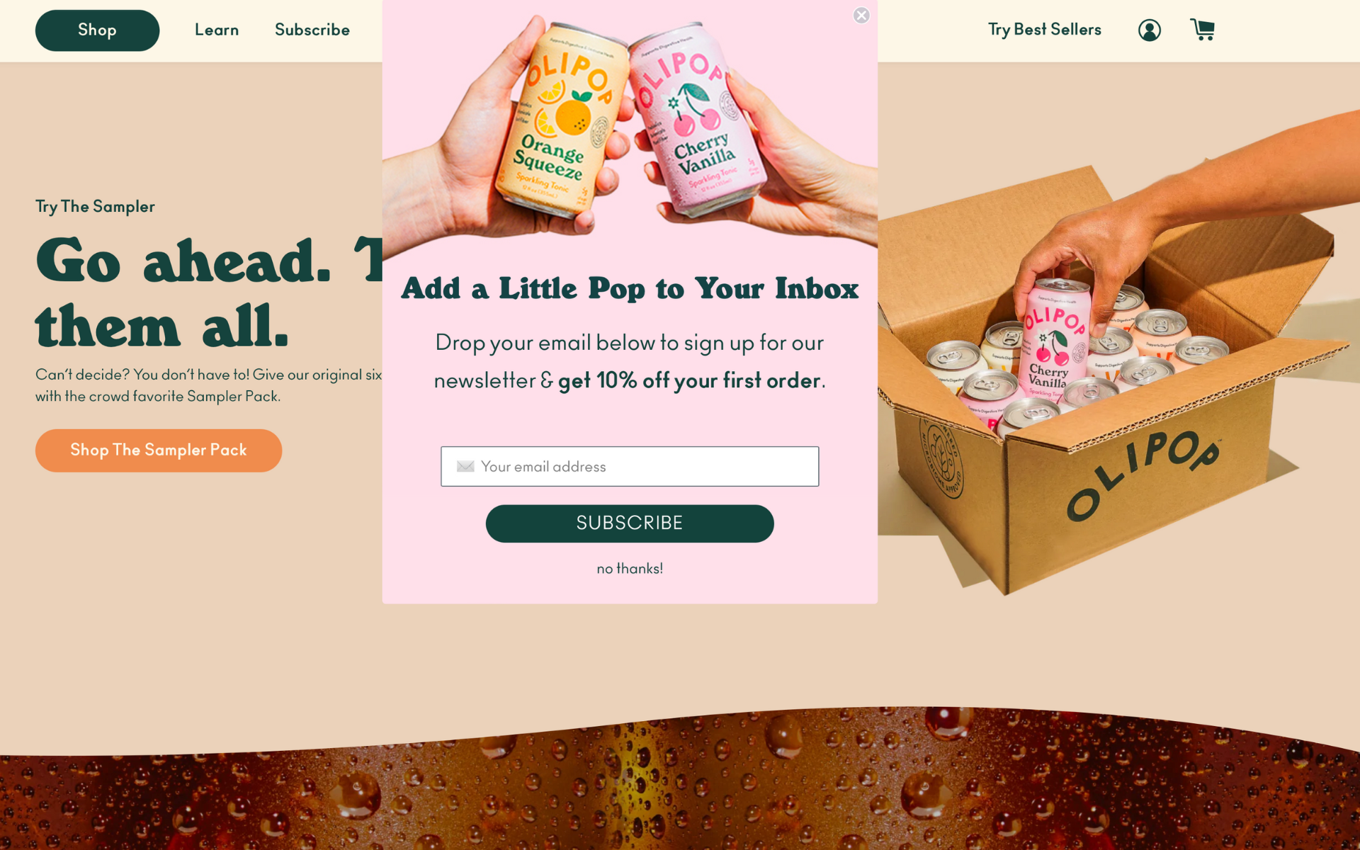
Olipop's pop-up features a 10% discount as its main incentive. The copy cleverly invites customers to "Add a Little Pop to Your Inbox" and encourages them to sign up for the newsletter by dropping their email below. This simple yet effective message is likely to catch customers' attention and entice them to take advantage of the discount offer.
Why we love it
Attention-grabbing tagline. The catchy phrase "Add a little pop to your inbox" is both memorable and compelling, drawing customers in and making them more likely to sign up for the newsletter. (sign us up 🙋♀️)
Creative. On-brand and visually engaging. The image in this pop-up is a perfect reflection of Olipop's brand identity, utilizing vibrant colors and a playful aesthetic. It also cleverly nods to the action that the brand wants customers to take, namely "cheers to healthy pop" and joining their community.
What we might change
The One minor issue we have with this pop-up is that it appears as a sticky overlay and the exit button is located too close to the browser tabs. This can be slightly frustrating for users and may cause some accidental clicks or navigation away from the page.
2.GOOD CULTURE

Good Culture's pop-up invites customers to sign up for their newsletter. The message is clear and concise, encouraging users to "Get the goods delivered straight to your inbox" and promising a range of benefits, including delicious recipes, exclusive savings, and product updates. Overall, this well-crafted pop-up is likely to entice customers and encourage them to stay connected with the brand.
Why we love it
Headline is catchy and to the point. We know exactly what to expect with their newsletter and in a weird way, they get us. For all cottage yogurt loves, this is most likely a dream newsletter to get recipe inspirations straight to their inbox.
Creative. We love the image because it says ‘it's so tasty you will finish it every time.’ The copy plays nicely with the image as well, especially the ‘ridiculously good’ playful wording.
What we might change
Since the promise of this newsletter is ridiculously good recipes, we would expect them to use a recipe style image here to get you to salivate over their product.
3.PICNIK

PICNIK's pop-up effectively utilizes incentives to capture customers' attention and drive engagement. It reads: take 10% off today plus recipes, exclusive product announcements, and (occasional) puppy pictures sent straight to your inbox. This well-crafted pop-up is sure to entice potential customers and build loyalty with existing ones.
Why we love it
Copy. The copy in this example is effective in incentivizing customers to make a purchase by offering a 10% discount. The JOIN + SAVE TODAY CTA button is also particularly well-designed and visually appealing.
Creative. While the creative design in this particular pop-up may not be extraordinary, it is clean and effectively showcases a range of different flavors. This simplicity can be a strength in some cases, allowing the product to speak for itself.
What we might change
It would be great to see PICNIK experiment with a different pop-up approach, such as one featuring a captivating gif of a hot cup of coffee being poured with creamer. This could potentially be a more enticing and thrilling way to capture customers' attention and drive engagement.
4.JOOLIES
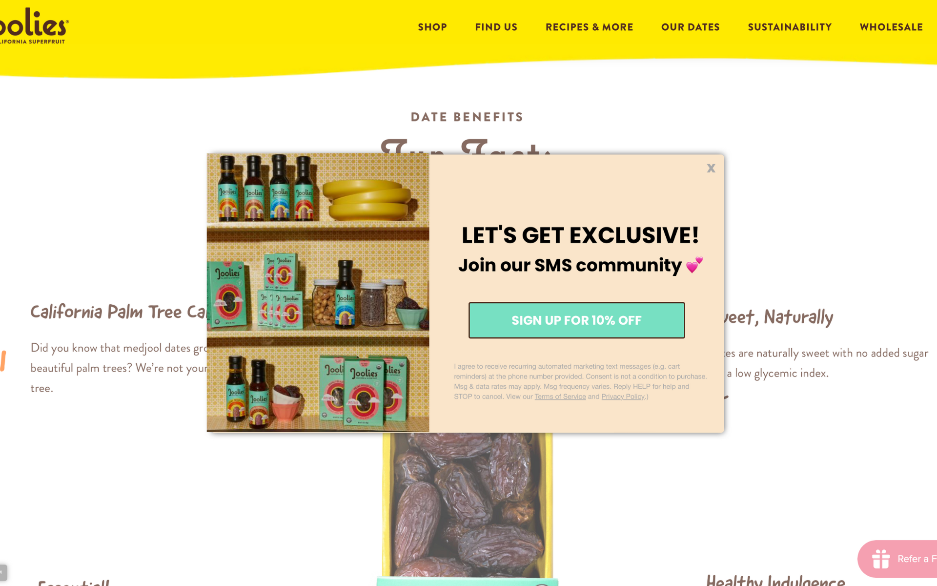
The image in this example is particularly effective in connecting with Joolies fans and customers. It creates an instant visual association with the delicious dates and is likely to resonate with customers who already have Joolies products in their pantries. The fact that they're using SMS as their primary channel to engage with customers is also a smart move, as it can help create a more personal and direct connection.
Moreover, the use of the word 'community' in their message is a great touch that further emphasizes the sense of belonging and shared experience. Overall, Joolies' pop-up is well-crafted and inviting, inviting customers to join their SMS community for exclusive content and special offers.
Why we love it
Copy. The copy in this example is spot-on in appealing to customers' love of exclusivity. Joolies' brand persona is well-known for being laid-back and fun, as evidenced by their popular Instagram and TikTok accounts.
Creative. The creative design of this pop-up is also a great reflection of their brand identity. The image is set in a natural and organic setting, effectively highlighting their product in a way that is both visually appealing and on-brand. The color coordination is also expertly executed, adding to the overall cohesiveness of the design.
What we might change
We don’t have any complaints on this one.
5.SUPERGUT
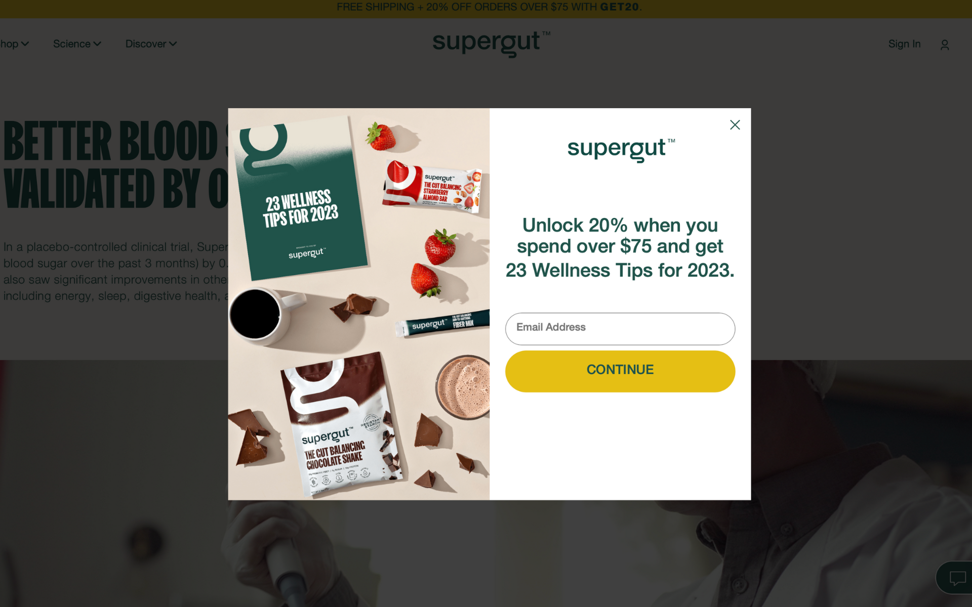
There are numerous reasons why we are impressed with this pop-up example. For one, the offer of a 20% discount on purchases over $75 is a great incentive for customers and has the potential to boost the average order value. Additionally, the promise of 23 Wellness Tips for 2023 is intriguing and provides even more value to customers.
The design of this pop-up is clean and straightforward, making it easy for customers to understand the offer and take action. Overall, the combination of a compelling offer and valuable content make this pop-up a great example of effective marketing. We were intrigued enough by the wellness tips to enter our email address, and we believe that other customers will feel the same.
Why we love it
Copy. The copy in this pop-up is an excellent example of how to offer value to customers. By offering a combination of money-saving discounts and helpful wellness tips, the brand is catering to customers' desires for both affordability and self-improvement.
Creative. The creative design of this pop-up is visually appealing and effectively showcases the range of products on offer. The inclusion of a cover for the wellness tips is a nice touch that adds a level of professionalism and care to the design. Overall, this pop-up is a great example of how to provide value and entice customers with both offer and content. Well done!
What we might change
One small suggestion we have for improvement is to provide a sneak peek of what customers can expect from the wellness tips. By adding this element, the pop-up could be made even more effective in engaging customers and driving conversions.
6.BEEKEEPER’S NATURALS

We're big fans of this brand and their Propolis Spray, and we have nothing but positive things to say about it. Regarding their pop-up, we noticed that the desktop version may not be as effective due to the light and airy background image used. However, the mobile version looks fantastic and provides a great user experience.
We particularly appreciate the use of a family of products image, which effectively showcases the brand's range of offerings and adds a sense of cohesiveness. The airy background also provides an excellent backdrop for the products to stand out and catch customers' attention. Overall, this pop-up is beautifully executed and the offer of 15% off on the next purchase, as well as access to new product launches, is simple yet compelling.
Why we love it
Copy. The copy in this pop-up is a standard message that offers a discount on the customer's first order. The message is straightforward and clear, making it easy for customers to understand the offer and take action. This simplicity can be an effective way to entice potential customers and encourage them to make a purchase.
Creative. We admire the use of a family of products image in this pop-up, as it effectively displays the brand's wide range of offerings and creates a sense of cohesion. The light and airy background also serves as an excellent canvas for the products to stand out and capture customers' attention. Overall, this well-crafted pop-up design is sure to engage customers and communicate the brand's product range in a visually appealing way.
What we might change
We would not change anything on this one.
7.DEUX

Deux has done an excellent job of making this pop-up look absolutely mouth-watering. Their visually-appealing design is a testament to the brand's unique and eye-catching aesthetic. We're sure many customers would be happy to give them all their money without hesitation!
It's great to see that the brand is focusing on SMS marketing, and their offer of $5 off when you sign up is a compelling incentive for customers. Overall, this pop-up is a great example of effective marketing that engages customers and encourages them to take action. Well done!
Why we love it
Copy. The copy in this pop-up is centered entirely around the offer, which is clear and straightforward. The message reads "Get $5 Off When You Sign Up for Texts," making it easy for customers to understand the value proposition and take action.
Creative. The creative design of the pop-up could be improved. The text is quite small and the layout is somewhat busy, which may make it difficult for customers to read or understand. Moving the pop-up to a more prominent location on the homepage, such as the center, could help to increase visibility and engagement. Overall, this pop-up has potential, but could benefit from some creative tweaking.
What we might change
Moving the pop-up to a more prominent location on the homepage, such as the center, could help to increase visibility and engagement. Overall, this pop-up has potential, but could benefit from some creative tweaking.
8.BLUME

Blume's pop-up is an excellent example of how to offer value while staying true to the brand's unique style. The inclusion of the cute Purple Heart emoji adds a fun and playful touch to the design, while the side-by-side layout effectively presents all the information on the left-hand side, allowing the brand's signature branding to shine on the right-hand side.
We appreciate the fact that the value proposition of 20% off is reiterated in the image itself, adding a sense of urgency and encouraging customers to take advantage of the offer. Overall, this pop-up is a well-crafted and effective design that offers value to customers while staying true to the brand's aesthetic. Well done!
Why we love it
Copy. The copy in this pop-up is well-crafted, with a clear and straightforward message that emphasizes the value proposition. The offer of "20% OFF SITEWIDE + free returns, always 💜" is prominently displayed and easy for customers to understand and act upon.
Creative. The creative design of the pop-up is also noteworthy, with a balanced and effective layout that features the message on the left and the products on the right. This layout allows customers to quickly and easily access the most important information while also showcasing the brand's products. Overall, this pop-up is a great example of how to effectively communicate an offer while also highlighting the brand's products in a visually-appealing way. Well done!
What we might change
We would not change anything about this one.
9.HELLO PRODUCTS
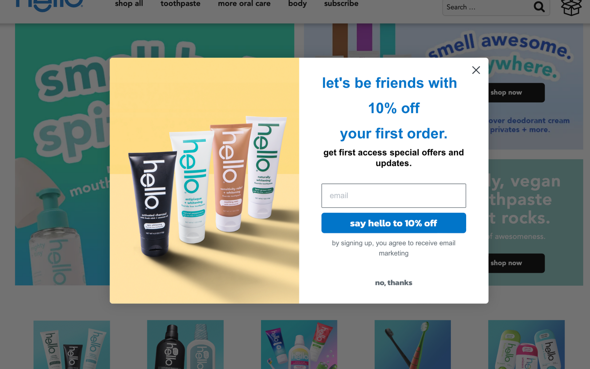
We think this brand has a solid pop-up, though we see some room for improvement in the image department. While we appreciate the simplicity of the current image, we think there's an opportunity to inject more creativity and personality to really make it pop.
That being said, we really like the way they've organized the information on the left and right sides of the pop-up. It's a great way to clearly present the offer and the brand message without overwhelming the customer.
Why we love it:
Copy. We absolutely love the friendly and inviting tone of this pop-up's copy. The message of 'let's be friends' is such a great way to make customers feel welcomed and valued right from the get-go.
We also appreciate the clear and concise breakdown of the offer: 10% off your first order, along with first access to special offers and updates. It's a great incentive for customers to sign up and start engaging with the brand.
Overall, we think this pop-up strikes just the right balance of warmth and clarity in its copy, making it a standout example of how to create a winning pop-up.
Creative. In terms of the creative, we do appreciate the use of a left/right layout to separate the copy and the creative elements. However, we do feel that the pop-up could benefit from some tweaking in terms of the fonts, layout, and colors. At the moment, it feels a bit overwhelming and busy. With some adjustments, this pop-up could be even more effective in engaging with customers and encouraging them to take action.
What we might change
While we appreciate the effort behind this pop-up's messaging, we do feel that the wording could be smoother and more streamlined. We would suggest using more fun creative on the left hand side and then revisiting the color of the fonts and the copy itself in this one.
10.FOUR SIGMATIC

This pop-up exudes a sense of soothing calm, much like that first sip of coffee in the morning. We're truly impressed by every element of this pop-up, from the design to the copy and beyond.
Why we love it
Copy. The promise of 10% off is sure to be a welcome treat for coffee lovers, and we appreciate how straightforward and effective this pop-up is in delivering that message.
Creative. In terms of the creative, the use of red, brown, and cream hues is truly spot on. This color palette strikes the perfect balance of excitement and calmness, creating an overall impression that is both energizing and relaxing. All in all, this is a well-executed pop-up that is sure to capture the attention of coffee lovers everywhere.
What we might change
We would not change anything on this one.
Pop-ups can be a powerful tool for any CPG brand looking to boost engagement, increase conversions, and build strong relationships with customers. By analyzing some of the most effective pop-up examples out there, we've uncovered key insights and best practices that can help any brand create pop-ups that truly resonate with customers.
From catchy taglines and compelling offers to creative visuals and strategic placement, there are countless ways to make your pop-ups stand out and deliver real value to your audience. By leveraging the power of pop-ups in your marketing strategy, you can create a truly customer-centric experience that drives results and builds lasting loyalty.